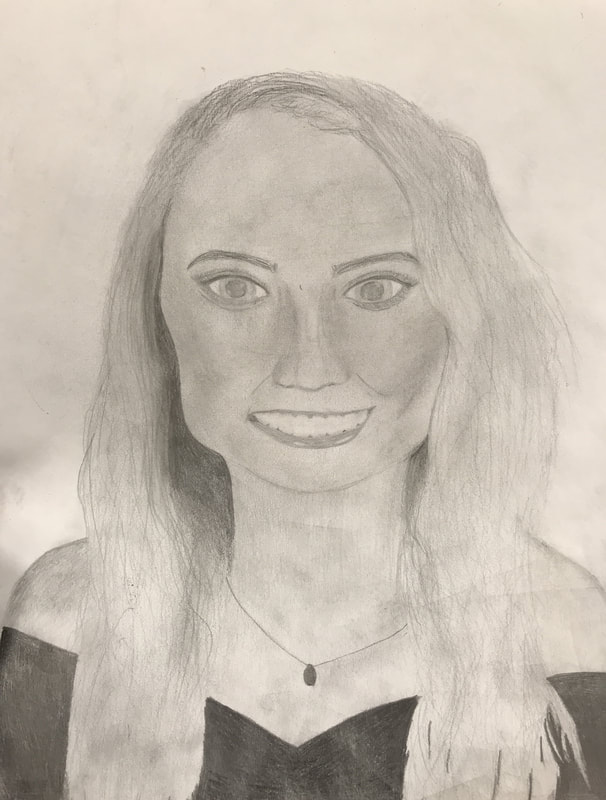
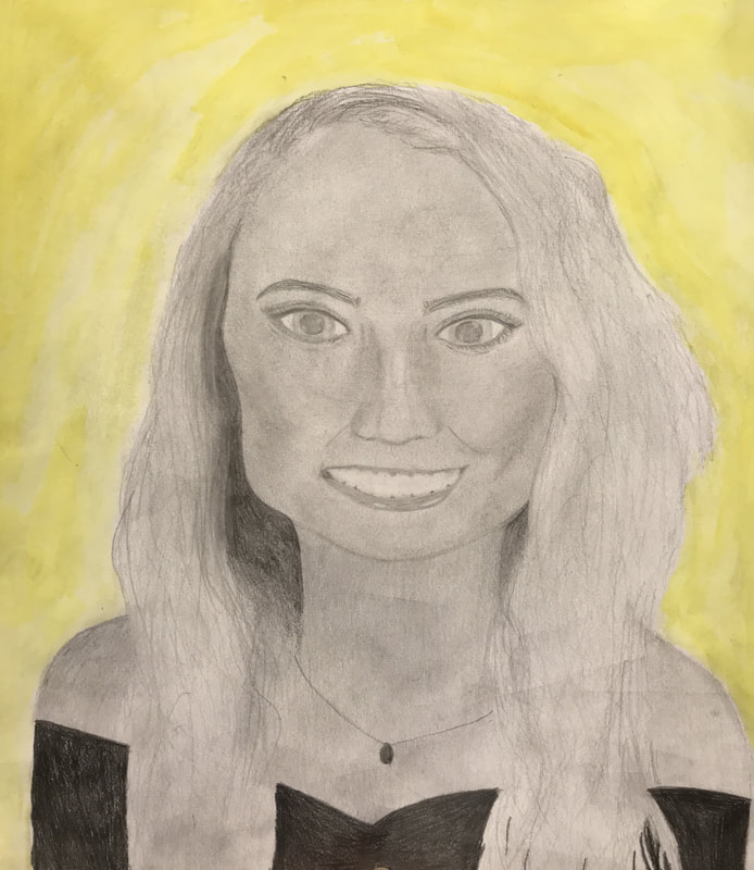
  I drew my sister, Emily. I used pencil. I started by outlining the head and then drew the eyes and used the sizes of them to help make the proportions of the face accurate. After I had sketched each part of the face I added value to each. Then I drew the neck and hair. Then I drew the shoulders. After that is done, I used watercolor for the background. I found the technique we were taught in a warm up on how to correctly draw a face with the right proportions very successful. I wish I fixed the size of the eyes.
0 Comments
Art Criticism Process: 1. Describe the artwork- List what you see in the artwork. What images do you see? How would you describe it over the phone. Which art elements? Describe the color schemes. 2. Analyze the artwork- list art elements and design principles. Color, value, line, shape/form, texture, space. Balance, emphasis, harmony, variety, movement/rhythm, proportion. 3. Interpret the artwork- what is the mood? What feeling is communicated? What ideas are represented? What is the story being told? 4. Judge the artwork- what do you think of the artwork? Is it successful? Why or why not? Support your opinions with evidence or criteria (art skills, meaning, creative, realistic) 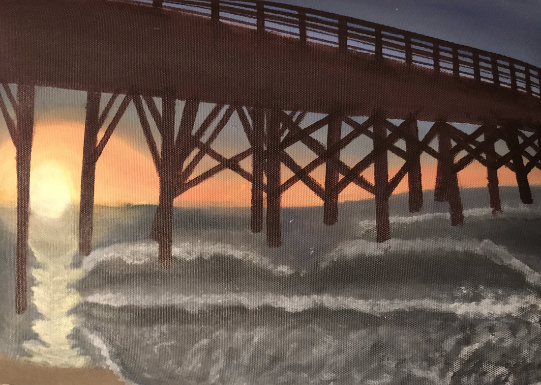 Critic of my work 1. Describe- In this piece I see waves within the water and a pier that is continuing on into the distance. The sunset is a mixture of shades of blue, orange and yellow. The sun is reflecting its rays onto the water below it. Near the shore I can see the foaming of the water. The ocean water is a grey-ish blue. The waves have a darker shade underneath to show depth. The color scheme is very natural, no colors are too bright or unrealistic. It gives it a calm feeling. 2. Analyze- Art elements in this include value within the ocean water. To show the waves coming up from the water and the light source casting a shadow under the wave, there is a darker shade of the grey-blue. Within the sunset, movement/rhythm is used with the mixture of colors. Each color transitions to the next one in a smooth way and blends together. Texture is seen in the foam of the water. A technique of painting was used to make the foam look splotchy and not like solid shapes. It makes it look natural. Emphasis was placed on the sun in this painting. It is the brightest part, so it catches the attention. Perspective is demonstrated with the pier getting smaller across the canvas to show it close up and then going in the distance. It gives the piece depth. Lines were also used in the pier to show its structure. 3. Interpret- The mood is calm and serene. The viewer can imagine themselves at this location hearing the waves calmly crash to the shore and can see the sky's beautiful display of colors. A sunset at the beach is a very peaceful moment. 4. Judge- I think the artwork needs lots of touching up, but it replicated the scene well and created the right mood for the viewer. The artwork is successful, but would be more successful if the sun's reflection on the water was less just solid paint, and if the technique of painting the waves portrayed them as more realistic. More experience and understanding of techniques is key to making this artwork better. My Three Questions: 1. Sketchbook: pick any warm-up from your sketchbook that you found beneficial, interesting or simply felt you handled well. Describe the activity and reason for selecting it above the others. Include photo. 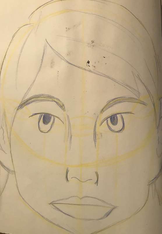 - This warm-up taught us how to properly draw a face with the right proportions. This helped me when it came to drawing the self-portrait because the picture I chose was a straight on picture so I could use the proportions in this warm-up for my piece. I had never been good at drawing realistic faces, always sticking to stick figure faces or silly cartoon ones. It was interesting to learn to draw more realistically. 2. Medium: which medium did you most enjoy working with and why? Which medium did you not use but wish you had explored? Include photo. - I enjoyed working with pencil the best because I never felt afraid to make a mistake or to change things around because it could easily be erased. I also loved how much an affect shading had on the whole piece and how it transformed it into more realistic figures. I wished I had explored more with charcoal, for I only used it in one piece. 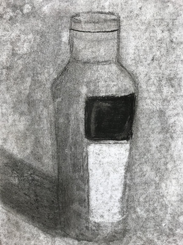 3. Was there a tool you had never used before and learned in this class? What was it and how did you use it? - I learned how to use the pfeil tool that is used for lino-cut print making. It was the cutter that carved out the sketches in the print making block to create our masterpieces. 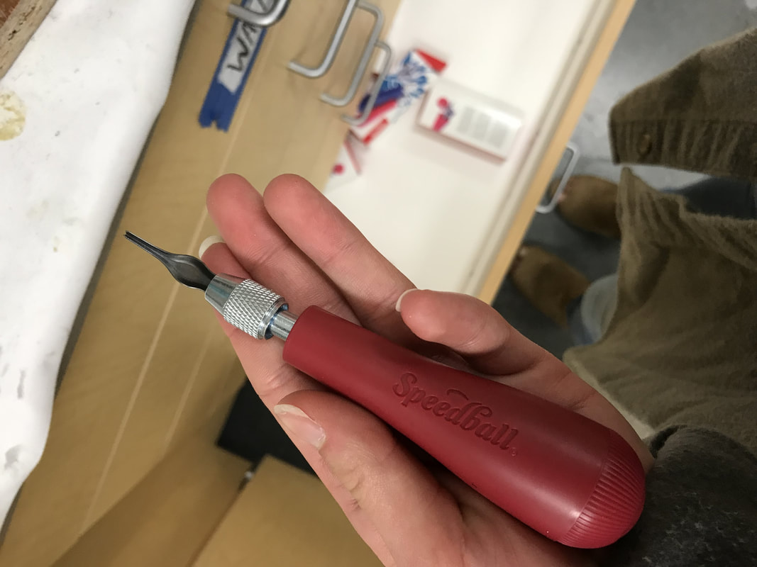 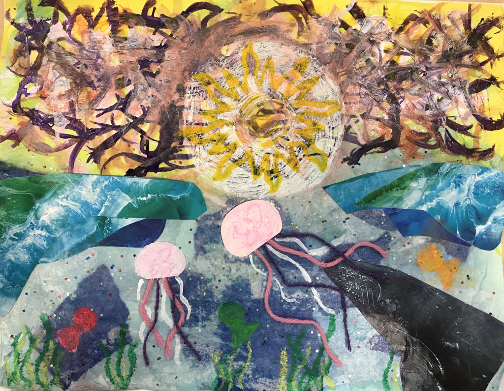 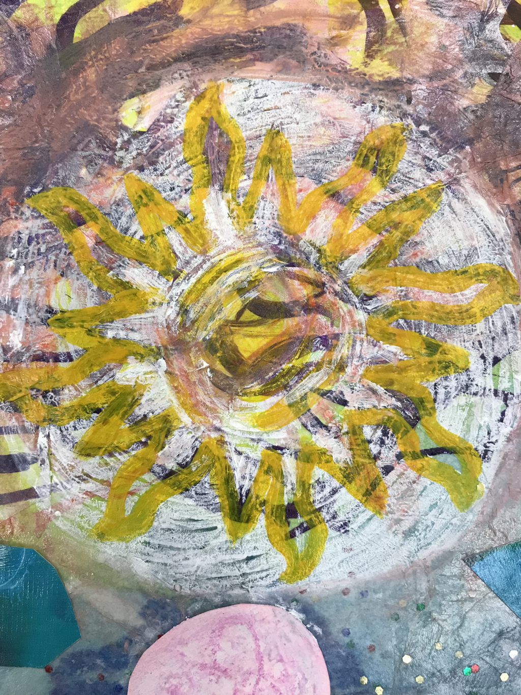 1. I used the linocut print for the sun and outline the shape of the sun with yellow acrylic paint to emphasize It more. 2. I used ink and put drops at the top of the paper and blew them around to create the sunset colors behind the sun. 3. I used magazine cut outs to represent the waves coming in from the ocean and as the whale in the ocean. 4. I used tissue paper as the water and sky. 5. I used construction paper and yarn to create jellyfish in the water.
I had the prompt “Think of the last place you traveled and represent It”. The last place I traveled was the beach so I represented the ocean at sunset. 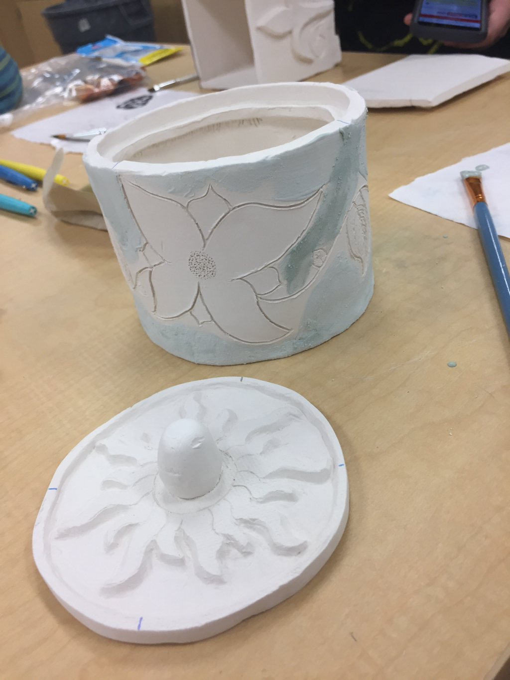 1.I plan to glaze everything, but the flowers and leaves on the side. I am going to put glass pebbles around the sun, so they melt and create a different texture and looked cracked. Inside of the pot I will glaze it black. 2. Making the lid the correct size to fit into the box was very difficult. I had to sand it down until It was the correct shape. 3. I found the sun carving the most successful. 4. I created a long rectangle slab and created a cylinder shape and then made two circle slabs and used them as the bottom and the lid. I scratched and slipped the greenware slabs to connect them together. When the box was bisque I put glaze on it and then fired it. After, I put acrylic paint on the non-glazed parts. 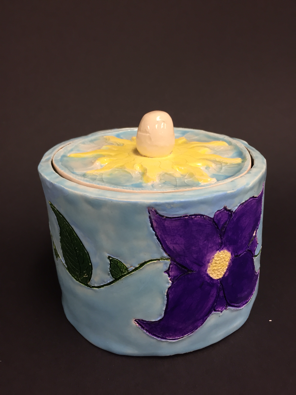 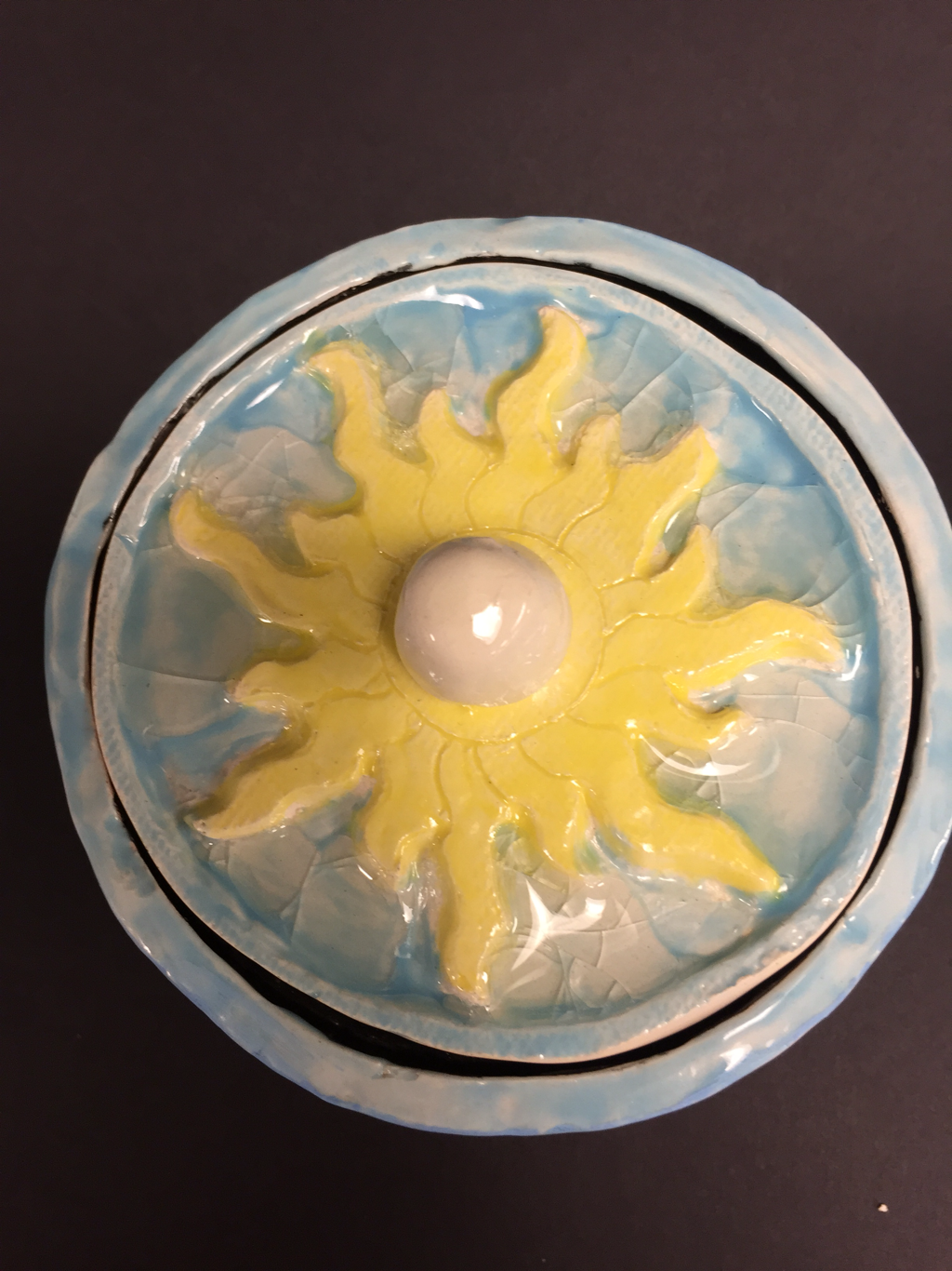 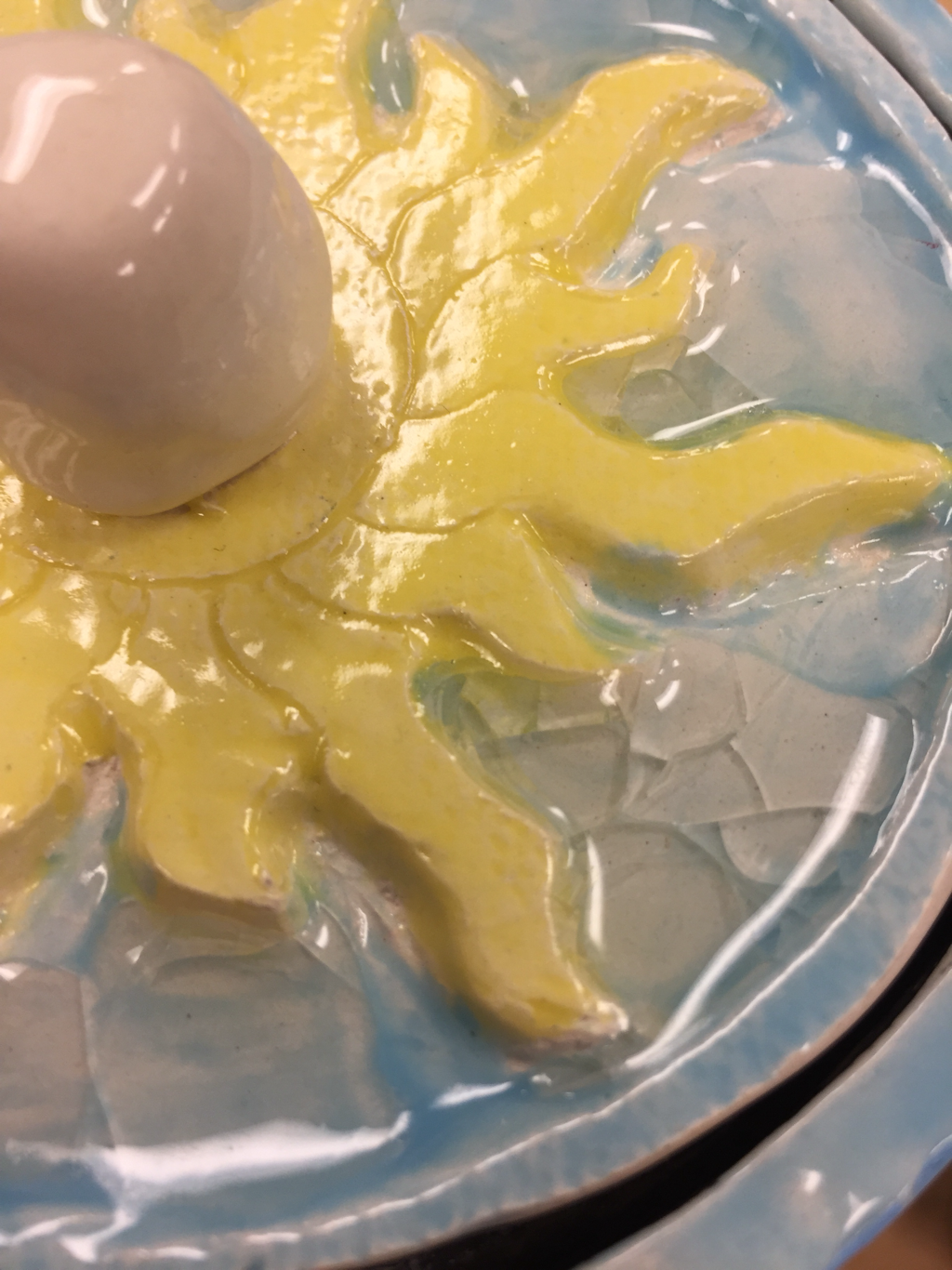 1. I fired it and have glazed the sun and the background. Once it was glazeware I painted the two flowers and leaves. I am finished.
2. I still find the lid with the sun the most successful part. 3. I would have painted the flowers and leaves better so the paint wouldn’t get on the glazed area around them. I also would have done a better coating of glaze. 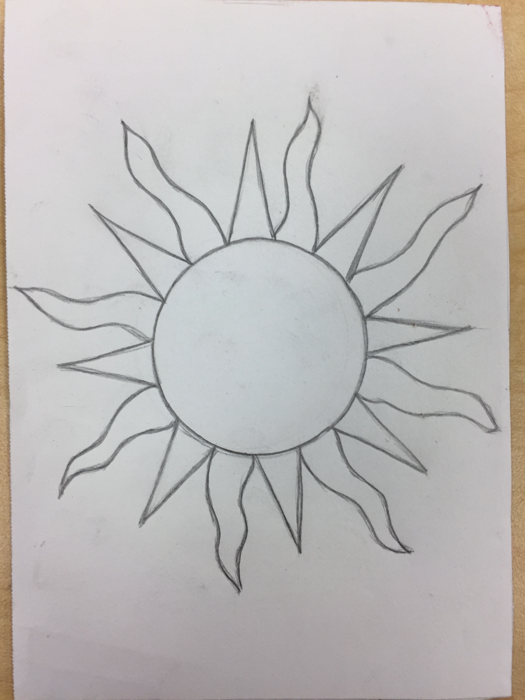 Sketch. 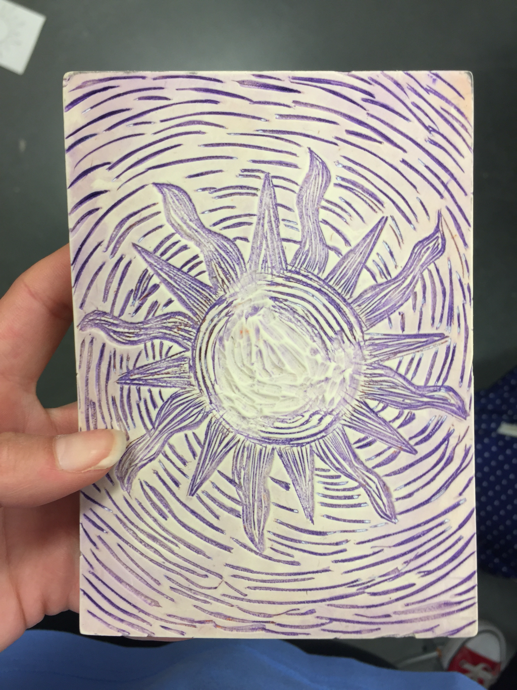 Linoleum block 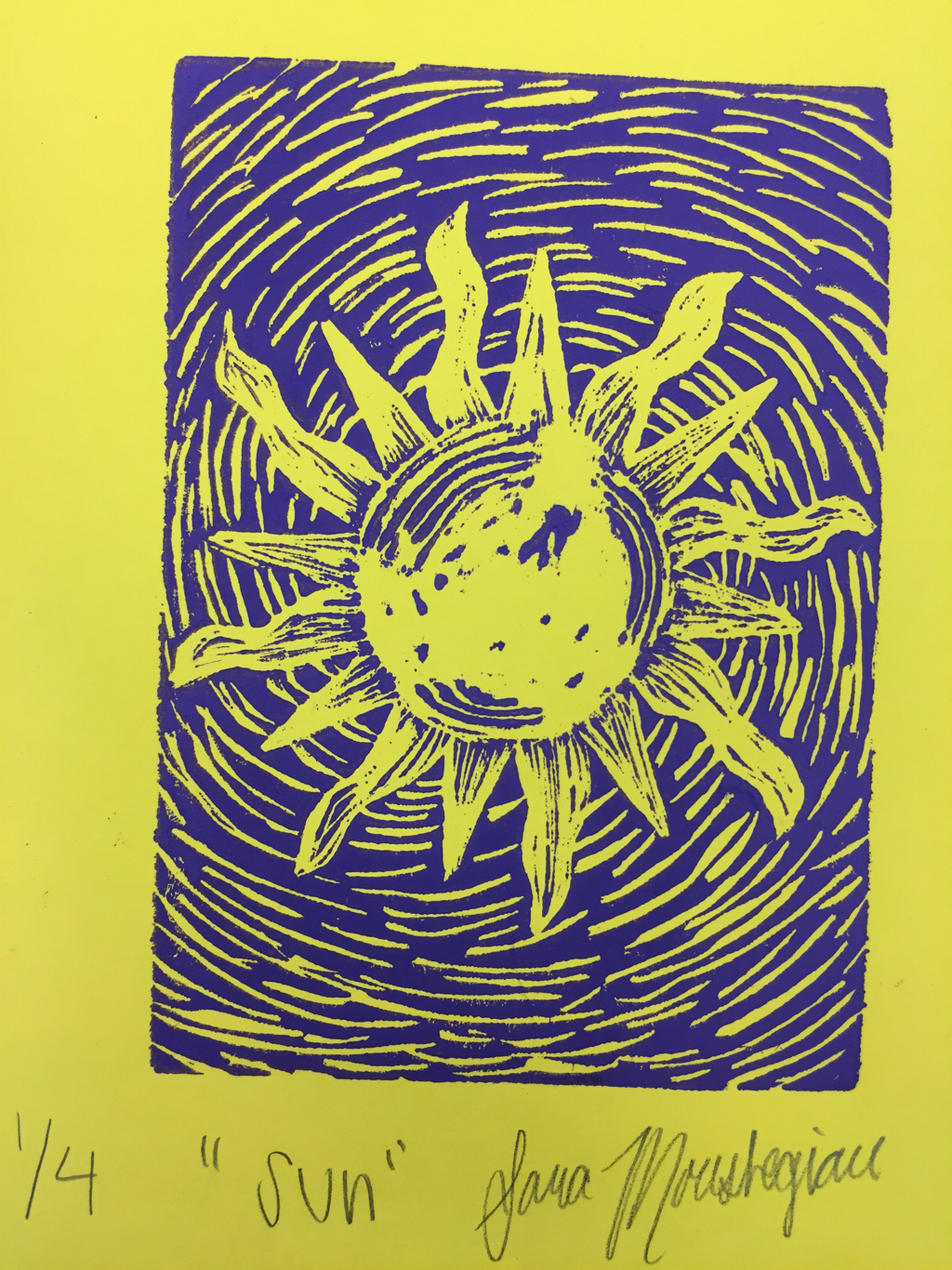 Best print. My print shows the theme “line” because within the sun there are certain lines that give it texture, not just a solid sun. Also, the background shows the sun radiating through the direction of the lines. My piece is successful because the shape of the sun turned out really well. One thing I could do better is make the lines within the sun more distinct so there aren’t random blobs of ink.
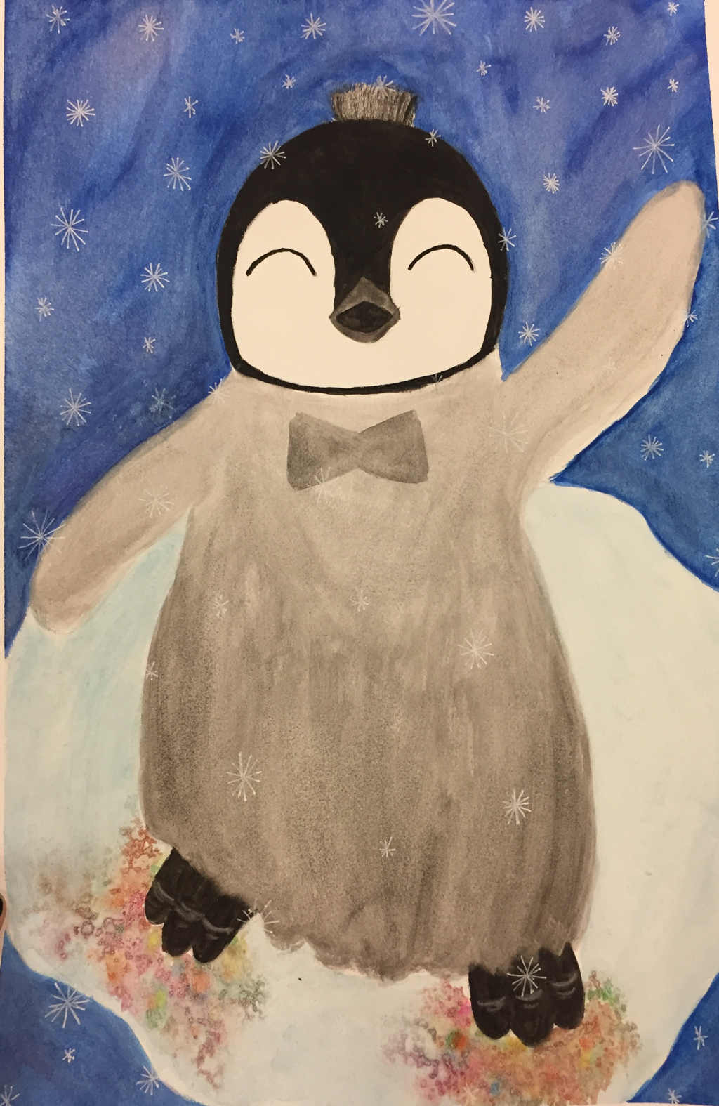 Finished piece. 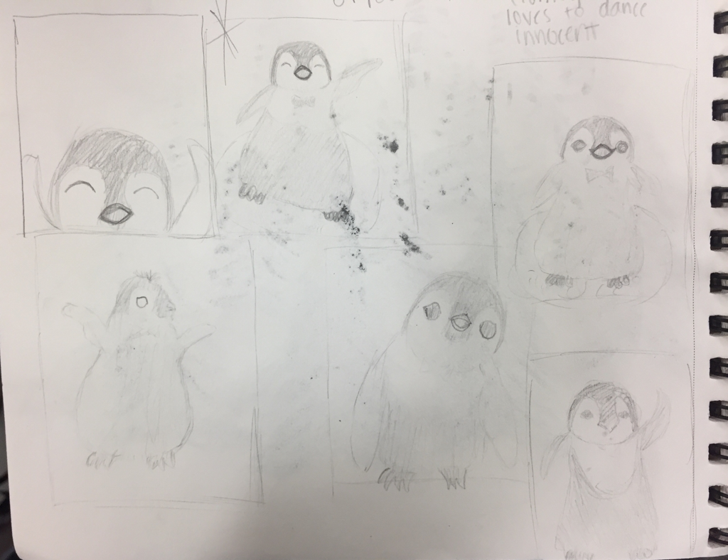 Sketches/in progress. 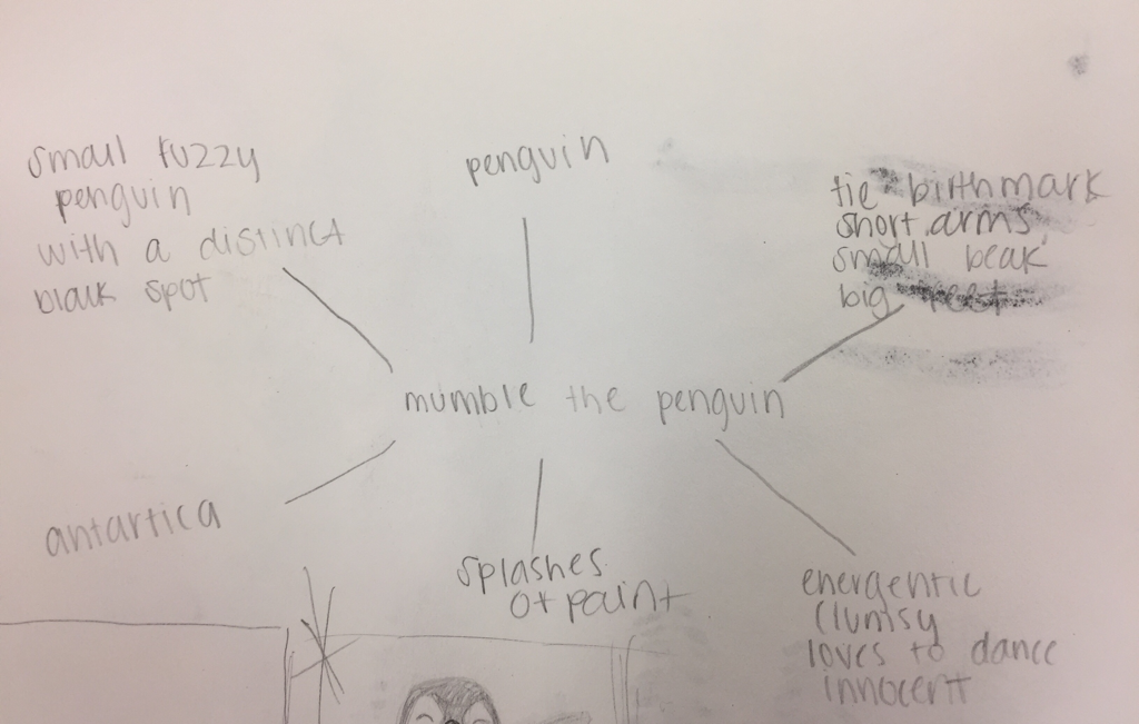 Mind map. 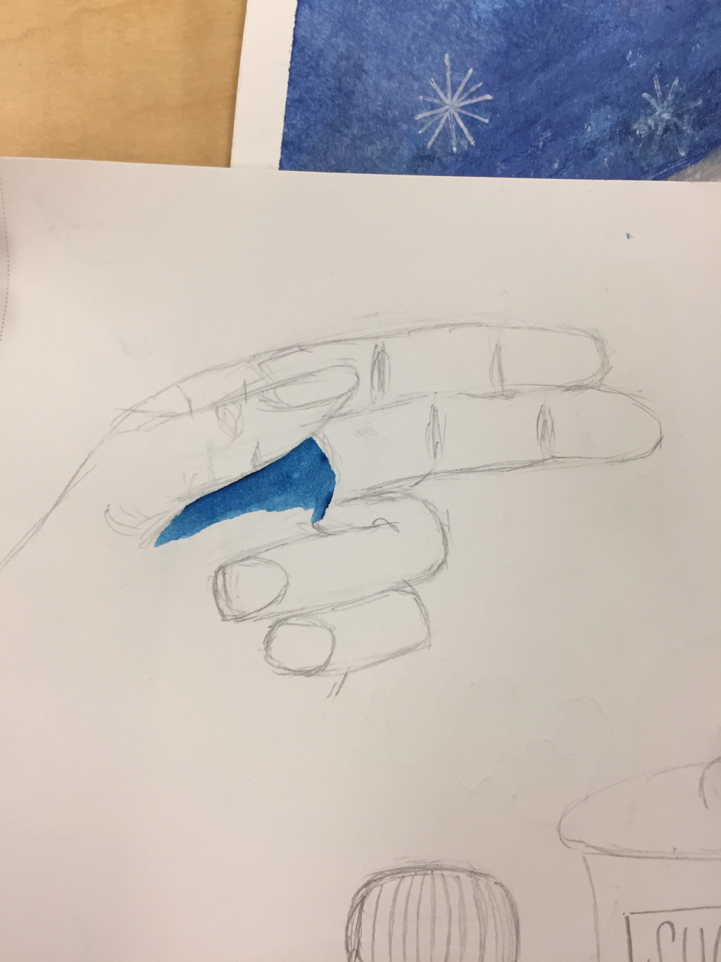 Most helpful warm up- drawing hands. I recreated mumble the penguin. My design differs because I added a birth mark and made his eyes look different(more happy) and I added tuffs of hair at the top of his head. When using the water color I went lightest to darkest and layered when I wanted the colors to be darker. I would recommend not layering too much because all the water starts to tear up the paper.
 hue value scale. 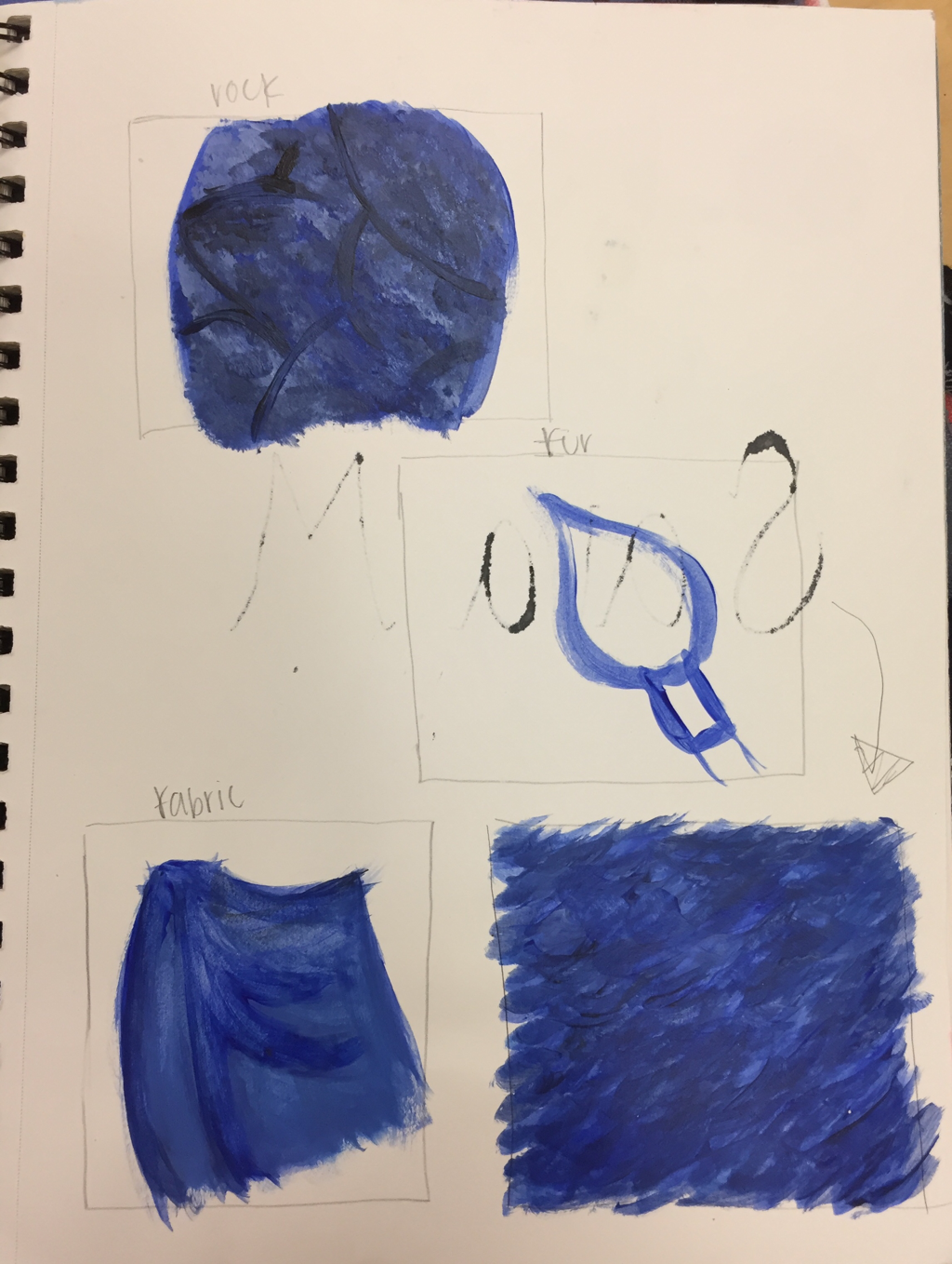 Most helpful warm up. 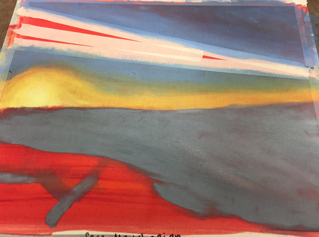 painting in progress. 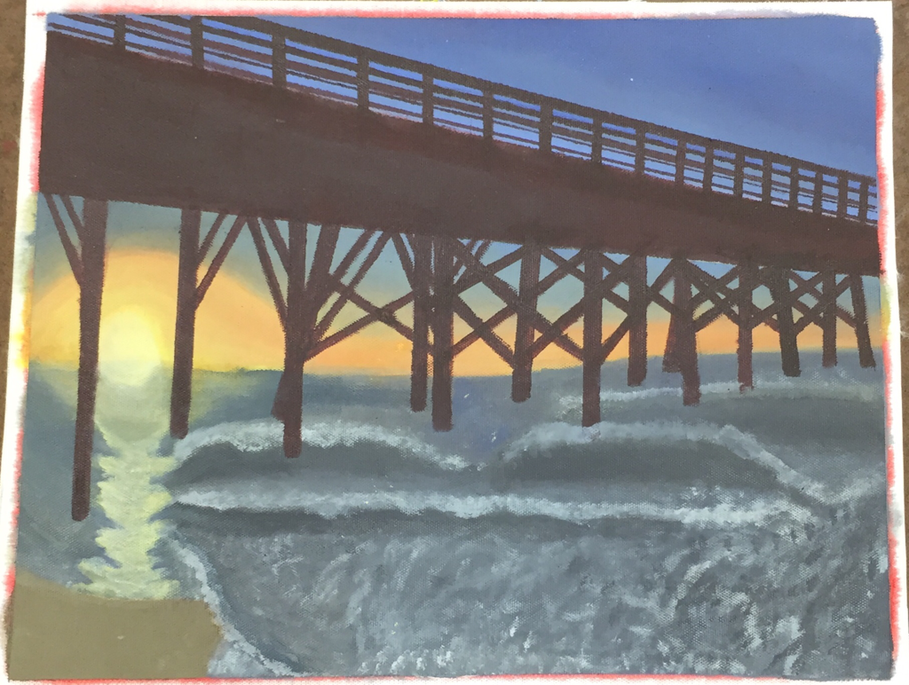 finished piece. A sunrise at Writesville beach is represented in this painting. This place is important to me because one of my best friends lives here and I go to visit her. The most challenging part of this picture was the waves in the water and making them look realistic. I think the pier is the most successful part of this piece. To paint this piece I first painted the sunrise, then the base color of the water and then added the waves. After that I worked on the pier using tape for the straight lines.
Thumbnail sketches 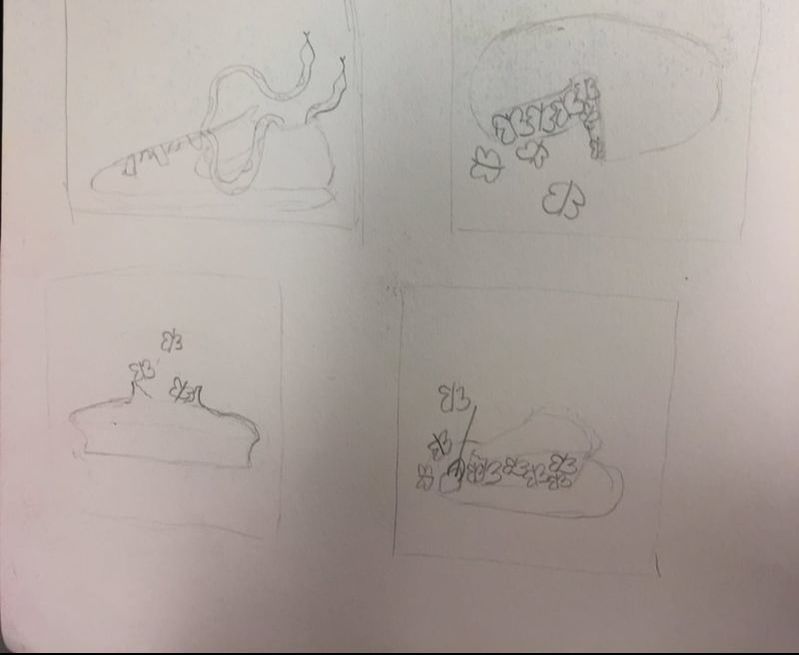 Piece in progress- my rough draft. The picture of my piece in progress was on my old phone and I lost all my pictures. 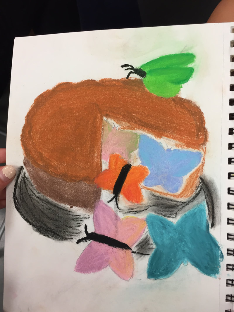 Final piece 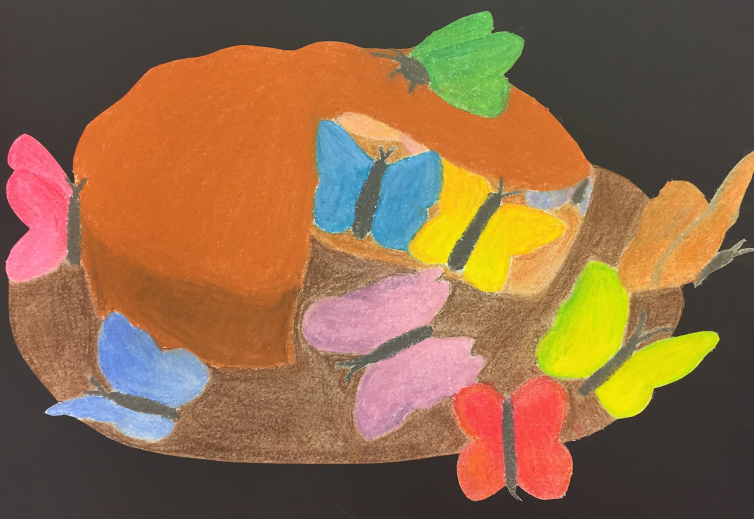 The medium I used was chalk because I thought the colors blended well together and would make the butterfly wings all look unique. I combined a pie and butterflies. At first, I came up with ideas of what objects to combine, and the pie and butterfly I envisioned a picture right away. I drew the thumbnail sketches, testing which angles of the pie looked the best and how the butterflies should fly out. I then did a rough draft in my sketch book to see how the chalk would turn out if I used it. I loved how it blended, so I started my final. I lightly drew the outline of objects with pencil. After getting the outline perfect I started coloring it in with chalk. It was very messy so I had to shake the paper many times into the trashcan. Once everything was colored in, I took an exacto knife and cut around the edges of the piece and spray glued it onto a black piece of paper to make everything stand out.
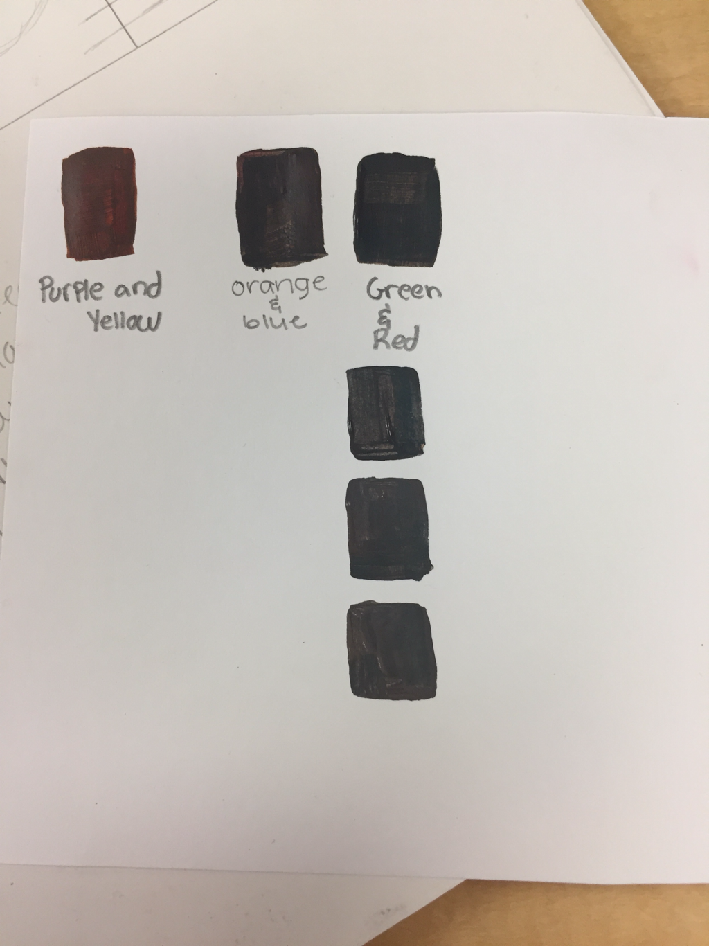 Today I learned that two primary colors mixed together create secondary colors. I also learned that adding white to brown can slowly make it turn grey.
You make brown by combining a secondary color with a primary color. Today I learned that adding yellow makes the color more vibrant. Also, I learned that adding blue is a better way to make a color darker than adding black. 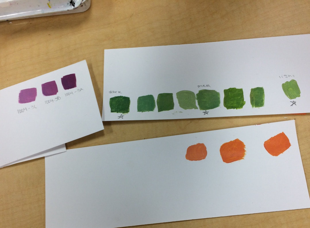 |
AuthorWrite something about yourself. No need to be fancy, just an overview. ArchivesCategories |
 RSS Feed
